Category Archives: Art

But Is It Art?

Koons

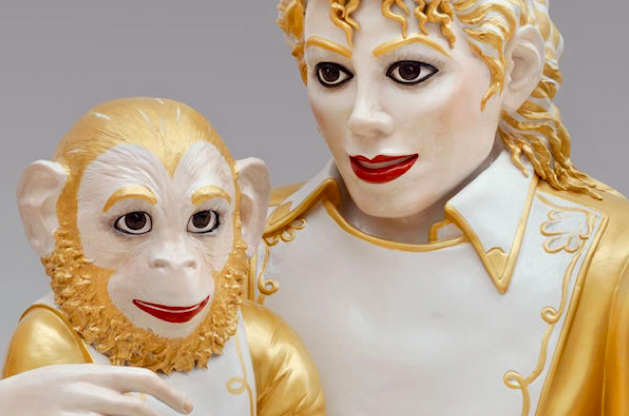
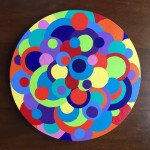
“Michael Jackson and Bubbles,” a life-sized porcelain sculpture by Jeff Koons, 1988.

I take art seriously, and often have very strong opinions about it. There are artists whose technical skill, taste or vision doesn’t match mine but whose work I can still respect and admire in some capacity. And there are a few whom I find so weak, irritating or vapid that I’ll admit to expressing some scorn for them in private. But while their work may not feel like it merits being described as art according to my internal art-o-meter, I am willing to be liberal in my acceptance of the use of the term “art.”

Multiple times, upon learning that I am an artist, I have had people tell me with big smiles and bright eyes that their favorite artist is Thomas Kinkade, and each time I bite my tongue and agree that his works are, um, quite cheerful. We can agree on that. Kinkade, the self-proclaimed “Painter of Light,” was hugely successful until shortly before his death in 2012. He was less an artist than a kitsch commercial illustrator with impressive marketing skills. He did not provide what I look for in an artistic experience, but he moved others, so when his admirers tell me how much they love his work, I do my best to show them respect. I may dislike the soft-focus, Kleenex-box-art style and subject matter of his work, but he touched people with his paintings, and their emotional reactions are real and important to them. Kinkade’s work prompts pleasing visceral reactions in people that bring them joy and comfort. So, much as his work turns my stomach, even it is art.

Essayist Joan Didion wrote, “A Kinkade painting was typically rendered in slightly surreal pastels. It typically featured a cottage or a house of such insistent coziness as to seem actually sinister, suggestive of a trap designed to attract Hansel and Gretel. Every window was lit, to lurid effect, as if the interior of the structure might be on fire.” I must admit to laughing and nodding in agreement when I read those words.

The glowing houses, churches and street lamps in Thomas Kinkade’s paintings are extraordinarily popular because they evoke an instant and comforting emotional reaction in so many people. His imitations of light were meant to bring to mind thoughts and feelings of an idealized old-time American home life: clean, cozy, quaint, old fashioned, oozing charm and warmth. As a nation our taste often runs to the sweet, the peppy, the saccharine, and we admire and appreciate those who serve up our stereotypes in the most sanitized and friendly way. A man who sells reproductions of his paintings in the hundreds of thousands, many touched up with selected highlights by worker bees so that they look more like actual paintings than the cheap copies they are (so they can be sold for hundreds or thousands of dollars each instead of the ten dollars they might be worth), Kinkade understood his market and grew rich by never underestimating the public’s desire for clichéd and emotionally manipulative imagery. According to Wikipedia, he was estimated to have made $53 million from his art works from 1997 to May 2005 alone. Yet in the last few years of his life, the manufacturing arm of his empire went into bankruptcy and he experienced a backlash from formerly devoted franchise owners who said he had misled them and knowingly ruined their finances.

Thomas Kinkade’s subject matter, style, technique and execution give me the willies, but his work is art, albeit bad art. Some disagree with me, saying that merely evoking a cheerful reaction with one’s creations doesn’t make one an artist. Art may be meant to provoke thought and emotion, to make us ask questions, to challenge, confuse, reward or transform us. And decidedly bad art like Thomas Kinkade’s does indeed challenge, provoke and confuse me—usually in ways I find unpleasant. But not every work needs to accomplish every artistic goal. Art can exist merely to delight, to embellish, to decorate, to provoke laughter or to express whatever thought, feeling or impression the artist wishes to convey. Bad art is still art.

Art can elevate or soothe, excite or inspire. Many works which I revile are still, in my estimation, important art because they successfully innovate, surprise or make me think. Beauty speaks to the soul, and each of us finds beauty in different forms. We seek out things that please our eyes and our hearts. Art does transform, but it can do that through humor or subtlety, elegance, spareness or outrageous joie de vivre. Art can also be kitsch, and sometimes that’s great fun. Takashi Murakami‘s pop-art pieces are terribly popular, and though my favorites among them look a lot like the vinyl flower power stickers found all over beat-up VW beetles circa 1970, they’re fresh and freeing. They’re genuine art.

Art asks questions of its viewers. Sometimes it’s crude and confrontational, other times sly and amusing. It provokes anger, excitement, disgust, even tears. Other times it invites laughter or thoughtfulness, or merely prods us to stand still and feel. It is not a bad thing to feel comfort or simple pleasure. Schmaltzy art may not be high art, but art it remains. Obvious, twee and soulless prints feel like caricatures of landscapes to me, but they bring joy to millions. I look down on an artist’s decisions to use technical ability in the service of creating sub-par paintings with trite subjects with no aspirations to be anything more than derivative dreck. But whether I like it or not, it is still art.

Thomas Kinkade achieved something that many artists of integrity cannot: he managed to evoke strong feelings in many of the people who view and enjoy his work. Just because those of us with art history degrees may look down on untrained eyes as having inferior taste doesn’t mean that the feelings of those without our training aren’t real or legitimate. We may denigrate Disney’s homogenized, dumbed down, often sexist animated fairy tales for blandly pandering to the lowest common denominator, but the fact remains that the technical quality of their creations is usually superlative, and their understanding of the needs and desires of their market segment has been remarkably keen for nearly nine decades. They evoke genuine strong emotion with imagery so powerful that indelible icons come to mind when we think of Disney.

Watching Disney’s simplified versions of stories and illustrations supplant the more elegant, subtle or powerful imagery found in its stories’ source materials can be upsetting. Disney’s Winnie the Pooh animation is nowhere near as gorgeous as Ernest Shepard’s original illustrations for A. A. Milne‘s books are, for example. But Disney’s work is still art. It may not be high art, it may not always be good art, but it is valid art, as are Andres Serrano’s “Piss Christ,” Robert Mapplethorpe’s S&M nudes, Picasso’s “Guernica” and Jeff Koons’s ridiculous, goofy and disturbing sculpture of Michael Jackson and his chimp Bubbles. Even Koons’s images of himself having sex with his real-life porn star ex-wife Cicciolina are works of art, if not art I’d want to own. Others’ artistic expressions don’t have to match our tastes to be valid. The art world is complex and ridiculous, but it also has endless room in it for an exciting panoply of expression—just like the rest of the world around us.

Impressions on Impressionism

Scrapers

[Revised from an article originally published on Laura Grey’s Little Hopping Bird blog.]

When Americans think of art museums and so-called great art, Impressionism usually comes to mind. Impressionist artists and their work are among the most popular in traveling exhibitions and Impressionist paintings are frequently reproduced on coffee cups, calendars, posters, stationery and other gift shop items. The art section of any bookstore is likely to be well stocked with books on Impressionists; in fact, you’ll probably find more of them represented than you will artists of any other style or period. If you have children in public schools, any art education they’re likely to receive probably includes repeated lessons about and images by Monet, Van Gogh and Renoir, with some nods to Picasso, Michelangelo and Leonardo da Vinci (who should always be referred to as “Leonardo” and not as “da Vinci,” by the way, despite what Dan Brown tells you—”da Vinci” isn’t a last name, but means “from the city of Vinci”).

Is this because Impressionists are better or more important artists than those who came before or after them? Probably not. Were they revolutionary? Yes, some of them were, some of the time. They emphasized a fresh way of seeing and of expressing what they saw, although artists had used loose brush strokes and tried to capture evanescent moments, the shimmer of gold, a quick impression of a lace collar or a glinting eye hundreds of years beforehand with fully as much wit and originality, to my mind. The influence of 17th century artists like Vermeer, Frans Hals, Rembrandt and Velazquez on the Impressionists is well-known. In fact, I find those original, inspiring 17th century works more beautiful, more exciting and more inspiring on the whole. The huge popular appeal of the Impressionists is largely because they’re more accessible; the pale colors are pretty, the shapes are indistinct and inoffensive, the subject matter is usually G-rated, universally acceptable and pleasing. Dark portraits of unattractive people, who were the subjects of some of the greatest works of the old masters, don’t have the same popular appeal as fields of poppies or women with umbrellas standing in sunny Provençal lavender fields. They look nice on cards to Grandma or on the dentist’s waiting room walls or on your office calendar. Pastels are pretty. Waterlilies are nice. We all like flowers.

Of course Renoir and Monet and their pastel-fancying contemporaries did see the world with fresh eyes and provided us with a new way of seeing and of expressing what we see. They are great artists, many of their works do challenge and please, and their works are worth knowing. But there’s so much more beauty in the world to challenge the eye and delight the heart, I wish people would look beyond the easy and obvious more often and think outside the Impressionistic box.

Some Impressionists move me greatly and delight my eye, of course. George Seurat’s pointillist masterpiece, “Un dimanche après-midi à l’Île de la Grande Jatte” (“A Sunday Afternoon on the Island of La Grand Jatte”), inspired Stephen Sondheim‘s Broadway musical Sunday in the Park with George for a reason: it is bold and arresting, beautiful and unusual, and the placement of thousands of dots of paint next to other complimentary or contrasting colors in order to create a freshness, depth and a magical reaction in the eye is delightful and original.

Edouard Manet‘s portraits of demimondaines in paintings like “Le déjeuner sur l’herbe” (“The luncheon on the grass“) or “Olympia” are worldly and confrontational, darker and starker than the sweet mother-and-daughter paintings of Mary Cassatt or the rotund, soft-focus, spun-sugar nudes of Renoir, who sometimes look to me as if they were dipped in frosting and rolled in candy sprinkles. Manet handles the paint roughly and uses flatter patches of light and dark to evoke dramatic lighting and moods, and his characters face viewers unapologetically and draw us into their world with some force.

Van Gogh is justly famous for his sunflowers and irises and his starry night, and I do love them, but his more disturbing portraits of working people and of himself really prove him to be a master. His work reproduces badly because his impasto technique of applying paint so thickly to the canvas as to make it almost a bas relief is so vivid and three-dimensional, it simply can’t be adequately represented in a two-dimensional approximation. Also, we’ve become so jaded by the endless reproductions of his work, it’s hard to see them as fresh and original and world-changing the way they were when he painted them.

Among Impressionists one of my favorites is Gustave Caillebotte (roughly pronounced KY-uh-BOT). His compositions are bold but pleasing, and his mastery of perspective and prodigious technical skills are extraordinary. His angles are dramatic and add such movement and excitement to a painting, and the people within aren’t frantic even though they are active, on the go, moving toward or away from us at a steady clip and with a sense of purpose. “Jour de pluie” (“Rainy Day”) has people walking directly towards us and being cut off at the knees, they’ve come so close.

The way they’re cropped makes them seem that much nearer to us, and we see just the elbow of someone retreating, so he’s right on the edge of the picture plane, pulling us with him into the thick of the action. Then there are the smaller figures cutting across the middle and the one carriage wheel moving off to the left, so while our eyes are drawn to the couple approaching us, there’s just enough cross-traffic to keep our eyes moving through the layers of activity toward the back.

Finally, there’s that marvelous flatiron-shaped building on the left jutting toward us, and the perfectly receding wet cobblestones on the left and the modern sidewalk on the right bisected by yet another diagonal. All those diagonals and perfectly executed examples of perspective are at just the right angles to imply movement without cluttering the composition so much that we’d be left exhausted and distracted by too many competing areas of activity. There are enough places for the eye to rest before moving on to keep us from getting tired out by too much clutter, and those resting points give us enough time to satisfy our curiosity before we move on.

It’s pretty nearly perfect compositionally. Consider the languid, calm faces of the couple approaching us; they’re engaged and active but not frantic, and that keeps the attitude of the piece right, too; too much animation in their faces would feel like overkill in such a busy painting.

Another favorite painting of mine is Caillebotte’s “Les Raboteurs de Parquet” (“The Floor Scrapers”). The angles of the diagonal lines vary from left to right to accommodate the shift in our perspective because we’re standing in front of and above the planers on the right. Again, the perspective feels perfect and makes us feel we’re right in the room, part of the action, so close we can hear the wood curls being shaved up from the floor.

I love the shininess of the unplaned wood planks versus the dull pallor of the planed areas, and the fact that the planers are shirtless, their skin buttery and similar in tone to the newly planed wood. The only curves in the room are the curves of their heads and arms and arching backs, the curve of the liquor bottle and glass on the right, which promise relief from their tiring work, and the swirling arabesques of the wrought iron on the balcony shown through the glass door. The men, the bottle and the iron work look so much more sensuous and sinuous than they would otherwise because of the severe contrasting lines of the floor and the molding on the back wall.

This picture makes tiring manual labor and tedious craftsmanship look sexy. The fact that the men are shirtless also makes us think it must be a hot day, and that lets us imagine the smell of the wood shavings and sweat. The exciting combination of perfect composition and the implication of controlled but constant motion and intensity of focus of each man elevates a painting of three hot, tired workmen toiling on their knees to strip a floor, the most seemingly mundane of acts, into something extraordinary.

Again, each setting and each character within the setting is perfectly composed. Not only is the relationship between elements harmonious and pleasing, but the faces of all the people in each setting are calm, unaware of the gaze of outsiders (i.e., we, the viewers) who have burst into their presence. We’re just a short distance from them yet they remain distant from us emotionally, which lets us feel safer and less confronted by their proximity, so we can peer at them more directly without feeling challenged by them, like voyeurs. That a painter can create such realism and intimacy with imaginary characters by applying some oily pigments to a stretched piece of fabric is astonishing. To me, that is great art.


My Architect: A Beautiful Documentary

architect

[Originally published on Laura Grey’s Little Hopping Bird blog.]

Louis I. Kahn (1901-1974) was one of the 20th century’s most influential and well-regarded architects. He designed such important structures as the Exeter Library at Philips Exeter Academy, and the Capital Complex in Dhaka (Dacca), Bangladesh, and his work was revered by high-flying architects such as I. M. Pei, Philip Johnson, and Frank Gehry. But his habits of overwork and overextension, bidding for too many projects and becoming obsessive about his all-consuming passion for architecture, led him to die of a heart attack, bankrupt and alone, in a Penn Station bathroom as he was on his way home to Philadelphia from New York. When he died, he left not only a wife and their daughter, but also a mistress and his second daughter, as well as a second mistress and his third child, his 11-year-old son, Nathaniel, who made a beautiful documentary about his father, “My Architect: A Son’s Journey.”

Nathaniel Kahn’s documentary visits and discusses the works of his father, some of which Nathaniel had never seen before, and shows the emotional and artistic impact that Louis Kahn and his work made on others, both architects and clients. But more than being a simple homage to his father and his works, the film shows Nathaniel’s search to understand his secretive, mysterious father’s compartmentalized life and to strengthen his connection to the father he lost so early. Louis Kahn’s charisma and charm, his love for his children and the feelings of great love and loyalty he engendered in the women in his life are all made clear, as are his self-absorption, his need to make every commitment in life secondary to his commitment to his work, his flashes of arrogance, and his lack of empathy for others. The question which underpins the whole film is whether the gifts of an artistic genius whose work engenders tears of appreciation from his clients and fellow architects can justify his remote, selfish, and disconnected life.

To his credit, Nathaniel Kahn doesn’t try to answer any of these questions once and for all; he interviews his two half sisters and talks with his mother, who still nurses the belief that Louis Kahn was about to leave his wife and come to live with Nathaniel and his mother before he died. He asks difficult questions and presses his mother to be honest about his father’s failings and selfishness. The responses are at times surprising and always sad and touching.

Although he admires his father’s work, Nathaniel Kahn doesn’t like every one of his father’s buildings. As he makes his pilgrimage to each one, he asks the people who live with and use the buildings how they feel about them, and admits when he finds one cold or impractical. When he visits the Exeter Library or the Institute of Public Administration at Ahmedabad, India, or when he goes to Bangladesh and sees how the Capitol and Parliament Buildings in Dhaka are enjoyed and made into the center of life for the local people, he is clearly moved. Sometimes the technical mastery of his father’s work, its appropriateness in shape, form, and function and its original and spare use of light and materials awe him, and we see him surprised and touched by the effect that his father’s work had on others.

It’s difficult to express what makes this film so watchable, moving, and fascinating. I suppose it boils down to three things I find endlessly illuminating: artistic masterworks, biographies of unusual and influential people, and bad family dynamics. This documentary is worth watching on any of those counts; as a work of art encompassing all three, it’s extraordinary.

I found a lovely site with beautiful photographs of Louis Kahn’s work; do check out “The Works of Louis I. Kahn: A Visual Archive by Naquib Hossain.” Hossain describes Kahn’s work elegantly as “A purposeful knot of complements and contradictions in a rich fabric of brick, mortar, and concrete, woven to being by natural light.” “My Architect” is a purposeful knot of complements and contradictions, too, and a lovely work of art in its own right.

Assemblages

Acrylic Paintings

Drawings

Watercolor Paintings