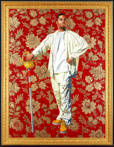
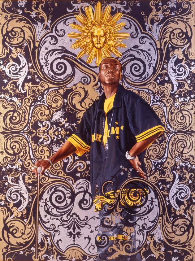
“Willem van Heythuysen” by Kehinde Wiley. The pose and the title are based on a 17th century portrait by Dutch painter Frans Hals. Photo from the Virginia Museum of Fine Arts
[Originally published on February 24, 2016]
As you enter “A New Republic,” the exhibition of paintings, stained glass windows, sculptures and triptychs by Kehinde Wiley currently at the Seattle Art Museum, you are met by the direct and confident gaze of an African American man astride a rearing horse. The man wears a camouflage jacket and trousers, Timberland boots and a bandanna tied around his head; a heavy gold velvet cloak encircles his shoulders and billows dramatically in the air. Though he and his horse stand on a rocky crag, their backdrop is not of nature but of a red and gold wallpaper design such as one might find in a Victorian drawing room. Draw closer to the monumental portrait and you’ll see hundreds of seemingly randomly placed undulating sperm cells delicately filling the interstices between the golden arabesques of the backdrop. More swirling sperm fill the egg-shaped corner medallions on the huge and ornate gold frame in which the painting hangs, obviously and humorously reminding us that this painting is all about manliness and the power of the male gaze.
Here is a celebration of the masculine life force. Those who know something of the history of Western art will smile, since the pose, the horse, even the words engraved on the rock upon which the rearing horse stands all come directly from one of the most famous equestrian portraits ever painted: this is a direct homage to Bonaparte Crossing the Alps, Jacques-Louis David’s 1801 equestrian portrait of Napoleon at the height of his power.
Continue through the exhibition and you’re met by other grand equestrian portraits. One painted shortly after the death of Michael Jackson features the late King of Pop wearing armor and portrayed as if he were King Philip II of Spain in a nod to a 17th century Baroque painting by Peter Paul Rubens. However, most of the portraits here depict not recognizable faces but everyday people found by the painter during one of his “street-casting” sessions. Wiley approaches strangers in public and asks them whether they’re willing to be photographed, usually in their own clothing, so that they might later be painted in the pose of an old master portrait of their choosing. While their likenesses may hang in major museums around the world and garner huge prices from avid collectors of Wiley’s work, the models usually remain anonymous, since Wiley prefers to title his portraits not after the sitters but after the people depicted in the portraits to which he pays homage.
Evoking well-known Western masterworks of the past with modern-day young men who display all the signifiers of 21st century African American masculine style is fresh and arresting, as is this fact: although they borrow the poses of major dead white European males, Wiley’s versions of the portraits usually depict black men between the ages of 18 and 35.
Wiley, himself a black, gay, American man, says that he chooses men in part for their sexual attractiveness to him, though he does not ask their sexual orientations. But in gazing upon them, he is knowingly sexually objectifying them, which has traditionally been seen as a way to take power away from the person who is being objectified. However, Wiley does this with the sitters’ assent and participation, so his sitters have the ultimate power over whether they are depicted in new works of art by a prominent internationally known artist, and in what pose they will be remembered. Wiley’s subjects exude power and self-awareness, but are left unnamed and undescribed. He chooses them not for their personalities, influence or station in life. It is enough that they are black, beautiful and capable of presenting themselves in a composed, dignified and quietly confident manner.
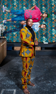
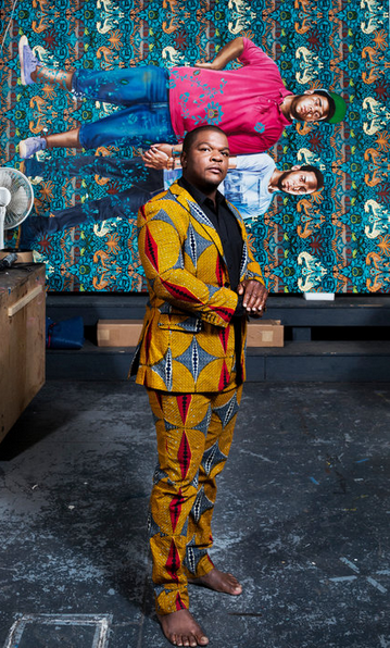
Kehinde Wiley at his Williamsburg, Brooklyn, studio with his painting “Jose Alberto de la Cruz Diaz and Luis Nunez” (2013). Photo by Chad Batka for The New York Times
Wiley’s creations in all their varied media serve to focus his gaze on attractive, confident young men who wield evident power with total comfort. Their poses are usually not so much arrogant as entitled: they address viewers directly without fear or anger. They often display the sartorial signs of success, including name-brand shoes and clothes. Even when they find themselves in dandified poses, Wiley catches them looking unsurprised to be presenting themselves as worthy of their evident power.
Over time Wiley has added more women to his work, and some of his most recent portraits feature elegant women in formal designer gowns instead of in their street clothes. Their hair is elaborately coiffed and they look like fashion models, but again, there is a sense of self-awareness and power in their expressions. These proud black men and women command attention without effort; they are vivid and dynamic symbols of black strength and power who assert the importance of their place in history and in the modern world.
In an interview with National Public Radio’s Audie Cornish, Wiley said of his decision to incorporate obvious product placement in his works, “Branding says a lot about luxury, and about exclusion, and about the choices that manufacturers make, but I think that what society does with it after it’s produced is something else. And the African-American community has always been expert at taking things and repurposing them toward their own ends. This code-switching that exists between luxury and urban is something that was invented in the streets of America, not Sixth Avenue.”
Most of Wiley’s portraits on canvas are based on photographs that he takes and then adjusts with computer applications to heighten their contrast and make their colors more vivid. But though he takes great care with the paintings of his subjects, he assembles groups of assistants in his studios around in the U.S., China and elsewhere to undertake the background painting in his portraits, much as the great 15th to 17th century painters of the Renaissance and Baroque period had their assistants fill in the areas behind the human subjects.
The backgrounds in his large portraits on canvas are not usually naturalistic landscape or elegant rooms—they are flat, decorative, repeating floral motifs such as one might find on wallpaper by Victorian designer William Morris or by 18th century designer William Kilburn. These floral backdrops hang behind the subjects of Wiley’s paintings, but sometimes elements of them—tendrils or branches or floral sprays—curve around in front of the subjects, surrounding the carefully rendered, three-dimensional human beings with flat fantasy gardens come to life. These delicate, elegant backgrounds contrast with the often dramatically manly subjects of the paintings, heightening the objectification of the body and pointing out the physical beauty in African Americans who have often been made to feel “other,” less than, ugly and unwanted by white Western arbiters of taste, style or value.
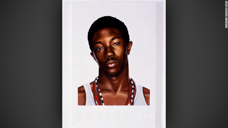
In 2006, Wiley found a crumpled police mug shot on the ground near his studio in Harlem. He used this symbol of a young man’s having been stripped of his freedom and power to inspire a beautiful portrait. The anonymous young man is portrayed with great dignity and honesty. Of the painting, NPR’s Audie Cornish said “It’s also the antithesis of the work people may recognize. … If anything, your work, for a lot of people, has been a rebuke of the mug shot when it comes to black men.” Wiley replied that his usual choice to portray black men in positions of power is indeed “a rebuke of the mug shot, it’s an ability to say ‘I will be seen the way I choose to be seen.’ All of the models are going through our history books and deciding, out of all the great portraits of the past, which ones do they feel most comfortable, which ones resonate with them. And so I go through the studios with individuals who go through art history books and choose how they want to perform themselves.”
The mug shot portrait is unusual for Wiley in that, while it shows an evidently self-possessed man displaying dignity and internal strength, it was created without the subject’s knowledge or consent. This back-story makes the viewer consider the question of the subject’s power or powerlessness, and whether Wiley has bestowed an aura of power on the man in the mug shot portrait while denying him the power to determine how and whether to present his face to the world in general. The questions of who has power, where it comes from and whether it is deserved hang over every piece in this exhibition, just as these questions unfortunately hang over the heads of all African Americans who feel that their presence and worth are constantly scrutinized and challenged as they go about their daily lives.
While many of Wiley’s works celebrate temporal authority, this new exhibition also places young black men in the context of spiritual and religious iconography, often posing as if they were martys and saints. One room is filled with elegant gilded triptychs, portraits painted on upright wooden panels with hinged closable doors on either side of the portrait, similar to the way that saints were depicted in shrines in Catholic chapels during the Middle Ages. These paintings don’t have vibrant stylized floral backdrops like the huge portraits on canvas do, but are intimate works of art with either Renaissance-style landscapes or Medieval-style gilding shimmering behind the beautifully, naturalistically painted portraits of black men in modern-day dress and hair styles. The T-shirts and tattoos and dreadlocks make it clear that the men featured in the triptychs are very much modern-day men in timeless settings.
In the stained glass room, tall and vibrant windows as boldly colored and intricately decorated as original 19th century Gothic Revival windows feature men in Converse shoes or Timberland boots, quilted vests and hoodies, African cloth shorts or cuffed jeans standing on plinths like statues, their halos shining above their heads. In these religiously inspired pieces, the subjects still exude great power, but their symbolic association with those who were too good for this world, who were martyred for their purity and courage, shows another aspect of greatness; the power that these men display takes a different, quieter form than his other work.
After the dramatic room-filling portraits on canvas, the intimate triptychs and the solemn, saintly stained glass windows, his oversize bronze busts of black men and women are impressive in that they show further diversity and skill, but they don’t mesmerize the way his other more colorful two-dimensional works do. However, the sculptures do show a charmingly cheeky side to his wit. In one exhibit, three nearly identical black female heads are arranged in a setting reminiscent of ancient Greek and Roman artworks depicting the mythological Three Graces. The three are joined together by enormously long and undulating locks of braided hair. In another, a solemn, dignified man wearing a dashiki, his chin up and head back, looks for all the world like a noble statesman posing for an official portrait from the front, but a bronze hairpick sticks surprisingly out of his natural afro in the back. The importance of black hair as a cultural signifier and symbol of connectedness and continuity within the black experience is underscored by the use of hair as an important decorative and unifying element in a number of Wiley’s paintings and sculptures.
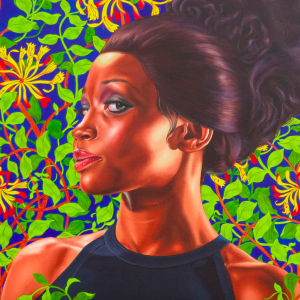
“Shantavia Beale II,” a painting by Kehinde Wiley, 2012. Photo from the Brooklyn Museum
Art critics are divided on whether to celebrate or deride Wiley for his techniques, his subject matter and his style. Some find the quality of the background painting that he hands off to assistants to be subpar; my experience of his paintings is that they appear to be composed and finished with care, and that they give an impression of greater precision than most large artworks do upon close examination. Other critics deride his reuse of tried-and-true, immediately recognizable poses from masterworks, finding it derivative.
I see Wiley’s reworking of clichéd art-historical tropes into fresh new hip-hop-infused celebrations of modern style as a bracing twist on tired themes. While some writers praise his prolific, vivid output across different media, others complain that he outsources the painting of the backgrounds to other artists (just as was the custom of the great European artists of the Renaissance and Baroque eras) and doesn’t give enough credit to the artists who inspired him. Some detractors find his choice to reuse classical poses unoriginal; they neglect to mention that the history of art has always involved the borrowing, reworking and downright copying of old masters by the new, and that it is this very obvious borrowing from the white Western artworks of the past that helps us to set these works in context and face the racially charged questions they evoke.
In the 16th century Michelangelo copied the sculptures of ancient Greece and Rome; in the 19th century Manet copied the pose of 16th century painter Titian; in the 1960s, Warhol made slavish copies of Campbell’s Soup cans and Brillo boxes and ushered in a whole new art movement. Pop art is today among the most valued and collected genres of art despite being derived from the most banal, repetitive and disposable elements in modern culture. If Warhol is a genius for having his (often unpaid) underlings endlessly reprint silkscreened images of popular entertainment icons based on photos that he didn’t take, color them unevenly in unnatural colors and then turn them over to him to sign, how can Wiley, whose works have layers of meaning and historical signifiers that Warhol’s works often lacked, be dismissed for following in the footsteps of earlier masters?
It is certainly possible for someone to find Wiley’s work lacking for purely aesthetic and technical reasons. However, it does seem that critics are often in a hurry to try to take him down a peg and to speak ill of him more directly and dismissively than they do other less-talented artists who also take inspiration from historical sources, like John Currin, or from artists who elevate pop culture (and even kitsch) to new heights (like Jeff Koons), but who happen to be white. It seems to me that Wiley’s composure and the confident ease with which he expresses himself in interviews might strike some as signs of unearned or unwelcome entitlement. The sense of pride and power with which he imbues his portraits can be found in his demeanor, but I see it not as arrogance or as a threat but as a strong sense of self. I wonder how much the discomfort some feel about his works stems from an unease over the idea of an African American having the power to make artistic choices and elevate those who look like him.
Criticism of Wiley, his work style and his aesthetic reminds me of white criticism of Beyoncé’s latest songs and videos; they’re unapologetically created from a black perspective with a black audience in mind. If we white folk appreciate it and want to buy it too, great, but it’s not specifically for us, and it isn’t the job of black artists to comfort or pander to whites.
Critics seem often to be looking for reasons to denigrate Wiley—his backgrounds are too thinly drawn, they say, or his use of decorative motifs undercuts the seriousness of his work. He cares too much about making things pretty and not enough about making them real, some cry. These complaints feel manufactured to me, and they deny the visceral power, the thrill, the vibrant, vibrating beauty that leaps off his canvases and suffuses the galleries in which his works hang or stand with a glowing, thrumming life force. Trying to reduce works of such emotion and energy to dry theoretical constructs strikes me as ridiculous, like trying to freeze-dry sunshine or to express color using only grey-scale photographs.
Like Warhol and Koons and Rubens before him, Kehinde Wiley is a successful businessman with many people working under him in order to allow him to manufacture expensive luxury goods at a fast clip. But Wiley’s works have a unique power to them, and they are fresh and unusual individual creative works; they are African American cultural signifiers like no others in the art world today. Wiley is clearly obsessed with creation and beauty, and regardless of whether he has assistants to help him, he is personally constantly visualizing and manifesting new visual magic all the time. While the subjects of his portraits look at ease with themselves, Wiley himself is happy to go to uncomfortable places with his art, and to challenge himself by traveling the world, learning about and painting brown-skinned people in Africa, Asia and Europe as well as here in the U.S.
In his NPR interview, Wiley told Audie Cornish, “My love affair with painting is bittersweet. I love the history of art — you asked me about that moment that I first looked at the stuff and when I first fell in love with it. It was only later that I understood that a lot of destruction and domination had to occur in order for all of this grand reality to exist. So what happens next? What happens is the artist grows up and tries to fashion a world that’s imperfect. Tries to say yes to the parts that he loves, and to say yes to the parts that he wants to see in the world, such as black and brown bodies — like my own — in the same vocabulary as that tradition that I had learned so many years before. It’s an uncomfortable fit, but I don’t think that it’s something that I’m shying away from at all. In fact, I think what we’re arriving at is the meat of my project, which is that discomfort is where the work shines best. These inconvenient bedfellows that you’re seeing all over this museum are my life’s work.”
Kehinde Wiley says yes to history, yes to his desires and yes to his vision of the world. His affirmative energy and his willingness to sit with and address uncomfortable questions of gender, orientation and power makes for an electrifying exhibition that invites us to enter into Wiley’s vision and live in A New Republic of his creation.


