Tag Archives: Painting

Can An Algorithm Rate Artistic Creativity?

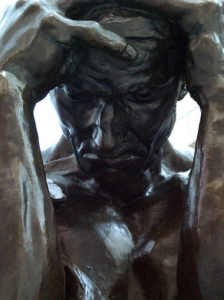
Burghers STanford

Detail from one of Rodin’s “Burghers of Calais”

[Originally published in 2015]

Wired UK and other media outlets report that computer scientists Ahmed Elgammal and Babak Saleh from Rutgers University have developed a visual algorithm which they believe can accurately rank historical artworks according to their creativity. Elgammal and Saleh define creativity as “the originality of the product and its influential value.” They use this definition to create what has been called an art network based on paintings’ (and some sculptures’) similarity to earlier works. Their experiment evaluated a variety of elements including color, texture and type of scenes depicted. Elgammal and Saleh compiled a database of art works from the 1400s to the present and used their algorithm to draw parallels between creative works.

This study, which purports to use computer science to measure the absolute creative worth of over 62,000 original works of art, is highly subjective and filled with inherent bias despite the programmers’ efforts to tease out evaluative absolutes by setting strict criteria. They seem to have assumed that their criteria covered the most important elements of what makes a work original or creative. Sadly, the whole enterprise and is at best flawed and at worst counterproductive to an accurate appraisal and understanding of what makes great works of art great.

A primary problem with such a test is determining what works to include and by which artists. For example, one artist who fared poorly in this project’s evaluation is August Rodin, an immensely popular French sculptor who has had an extraordinary impact on sculptors who came after him. Rodin is best known by the general public for two works, “The Thinker” and “The Kiss,” which are, to my mind, among his less exciting pieces. Indeed, “The Thinker” was conceived as a small part of his masterwork, “The Gates of Hell,” a monumental sculptural bronze work which depicts scenes from Dante’s Inferno, and versions of “The Thinker” appear in each of the cast bronze versions of the gates on display in museums around the world. Those who study and collect art are generally much more excited about “The Gates of Hell” and Rodin’s “Burghers of Calais,” which are considered his most emotionally powerful works. Each was cast in multiple versions and is  displayed in numerous locations around the globe.

“The Gates of Hell,” a  bronze gate covered in writhing bodies, and the somber collection of chained men dressed in rags that makes up “The Burghers of Calais” are, I would argue, more important to the development of 20th century sculpture than “The Thinker” or “The Kiss.” They are, however, much less well-known among those who only have a cursory interest in art. These more influential works are deeply psychological and disturbing sculptures featuring people in torment, not the placid, pleasing sculptures that those who know little of Rodin’s work may think of when they hear his name. Rodin, who lived a long, passionate and prolific life, created thousands of heads, bodies and body parts of clay and bronze and he created portrait sculptures that sometimes offended those who posed for them with their raw, unfinished, often ugly qualities. For more than a century, serious students of art have studied and copied Rodin’s work and techniques, and his more distorted and disturbing  sculptures have been among the most influential works of the last 150 years among modern artists.

If your specialty is programming and not art, you might not know to include those works among your sample. You might choose only his more generally popular works and assume that because they are more frequently copied, photographed or parodied, they are the more important pieces. And if you do that, you’ll get a skewed result, which is exactly what happened.

This study is getting a great deal of attention because of what was written about it by Daniel Culpan of Wired UK and in careless quotations of his work by other publications. Mr. Culpan is not conversant enough with art history to know basic terminology about the discipline. He did not appear to know enough about the subject to challenge some of the computer scientists’ biases and assumptions, and he apparently did not fully read even the short precis of the paper which he seems to have skimmed. He failed to mention, for example, that the artworks include not only paintings but also sculptures. The republication of and references to his article by Ars Technica and Smithsonian both repeat this error. Also, the art historical term “old masters,” which Mr. Culpan apparently erroneously believes means all important artists of the pre-20th century period, actually has a more specific meaning and commonly refers to works painted from approximately the 13th to the 18th centuries, up to about the year 1800.

Two of the artists Culpan describes as “old masters” who rated poorly in the computer assessment of their creativity actually lived and worked significantly after the “old masters” period: Ingres painted in the late 18th and early 19th centuries; Rodin sculpted in the late 19th and early 20th centuries. They are artists we consider to be part of the canon, but Ingres predates the modern era by only a few decades, and Rodin worked during what most art historians would consider to be the modern era.

Some wonder whether this study “proves” that some long-lauded artists might have been overvalued by those who lived before computer-aided evaluations were available. In the cases of Ingres and Rodin, their works (and Rodin’s in particular) are so unlike any others by their contemporaries that they are easily recognizable as having been created by those masters. I would argue that Ingres and especially Rodin were powerfully influential and that they saw things with a different eye than those who came before them. However, they worked primarily with traditional subject matter—figurative portraiture—in recognizable ways; i.e., their subjects’ body parts are generally recognizable as such and appear in the name locations as real body parts do, unlike paintings or sculptures by artists like Picasso, say, who moved eyes and limbs around on the bodies of the subjects he painted.

Sometimes Picasso painted multiple views of the same body part from different angles and incorporated them all into one portrait. Artists like Matisse distorted the colors of body parts, painting faces green or red when it suited him. Such altering of basic elements of human anatomy in one’s art could be considered more creative, and showing creativity (according to this definition) could be considered to be a better or more advanced form of art, or more impressive or important than producing images based more closely on figurative norms. Making recognizable portrait paintings of nobility, as Ingres did, could be seen as less “creative” than building most of one’s oeuvre out of stacked boxes and lines, like Mondrian, or collages, like Braque, or simplifying figures to their essential shapes and distorting them, like Munch or Picasso or Dali or Lichtenstein. But reducing creativity to such simplistic, easily measured or described metrics is unfair and damaging if it allows us to discount the importance, beauty, influence and ineffable magic found in historically earlier, more subtle or more “mainstream” works of art.

Taking these works out of their historical settings does them a disservice in determining how influential they were on the art that followed. The creators of this study tried to determine the influence of artists on those who followed them and to determine how different they were from what came before. But such differences were much more subtle during earlier centuries, and changes in style usually came about more slowly in past centuries than they did from the mid-19th century onward. Changes in art sped up throughout the 20th century, and now there are so many competing styles, media, techniques, mindsets, methodologies and concepts that one can no longer describe a prevailing artistic sensibility as being representative of the modern era. Technology and speed of communications changed artists’ ability to influence each other, and that sped up creativity, by one measure of the term. But since we modern types tend to think of “creativity” as an inherently positive term, I fear conflating the idea that something is “different” and therefore more “creative” in some ways with the idea that it is therefore better or more valuable.

In past times, the differences between two styles of art could be seen as monumentally important to earlier artists or to professional art historians, but those differences might be almost imperceptible to modern people without training and context. For example, Early Renaissance master sculptor Donatello and High Renaissance master sculptor Michelangelo each created important statues of the biblical figure David between about 1440 and 1504, and those who study art history see them as vastly different in feeling, symbolism, strength, influence and style. Someone without training, however, might very well see them as two boring, traditional nude dudes. Someone with no training at all can look at paintings by Salvador Dali, Rene Magritte and Andy Warhol side by side and see that each is different from the other and none is like anything seen before, and by that measure they could be seen as much more original, creative or even valuable than the works of Michelangelo. Each of those artists is hugely important and influential, but to put Magritte into the same category as Michelangelo would be ridiculous and unfair. Michelangelo’s works’ relative similarity to sculptures done by Roman artists 1500 years earlier does not make him a less creative or important or original artist for having copied and appropriated techniques from ancient works so well.

I fear any project that would use loaded terms like “creative” to rank, describe or value artists is likely to mislead those outside of the art world into believing that there are absolutes and discernible metrics that one can use to boil artworks down to their essence and take the guesswork out of determining meaning or value or rank. Such a ranking tool cannot exist because an essential element of art is that it can be valued in multiple ways, and that a work’s value is not solely the price for which it can be sold but is also derived from the meaning it has for the creator and its viewers. One can no more value a work of art than one can a human life. Yes, it can technically be done in a court of law or an auction showroom, but each of us holds a particular person or possession dearer than any court or auction house would, and we would argue that that person’s or thing’s imputed value has nothing to do with the value we sense within our head and heart. That is what makes art great and more complex in meaning than a garden hose or a box of cash. Each of us brings our own meaning to and derives our own value from a work of art in a unique way, and a computer program cannot do that for us.

According to this computerized assessment of relative creativity, Munch’s “The Scream” is on a par with Velazquez’s entire artistic output. In actuality, Munch’s dark, disturbed paintings owe much to the interior moodiness of 17th and 18th century masters like Velazquez and Goya, just as the nihilistic artists and writers of the late 19th and early 20th centuries could not exist without the influence of the writers and artists who came before. To take them out of context and rank them in this raw and bloodless way feels, to me, preposterous.

Margaret Keene’s big-eyed portraits of the 1950s and 1960s were distinctive and immediately recognizable and they inspired many copies. These aspects of her work could be considered signs of great creativity according to descriptions of elements considered by this study. Keene’s works are, however, generally considered to be kitschy, shallow and lacking in artistic merit. Rodin, on the other hand, created rough, lumpy, often ugly portraits that many believed looked half-finished or hideous, but this freshness and openness to a reassessment of what constitutes a completed form had huge influence on modern sculpture. However, most people who know little about art history are only familiar with his statues “The Thinker” and “The Kiss,” which are more smooth, finished and conservative in their style than most of his works and are less appropriate examples of the originality and influence of his work on artists themselves. I think his scoring so poorly on this “test” of creativity better shows the weakness of the creators’ understanding of which works of his should be evaluated and included in the test than it does the level of his creativity.

The project is interesting, and it is heartening to see people in tech fields showing an interest in the fine arts. However, the metrics the project uses to measure artistic merit are biased more toward novelty than quality, and they discount many of the key elements of artworks most prized by professional art historians and collectors. Elgammal and Saleh make so many value judgments based on personal opinion that the result is a controversial evaluative tool of very limited use.

Black Power and Beauty in the Portraits of Kehinde Wiley

Screen Shot 2016-02-24 at 12.45.30 PM

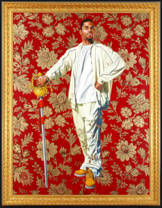
“Willem van Heythuysen” by Kehinde Wiley.  The pose and the title are based on a 17th century portrait by Dutch painter Frans Hals. Photo from the Virginia Museum of Fine Arts

[Originally published on February 24, 2016]

As you enter “A New Republic,” the exhibition of paintings, stained glass windows, sculptures and triptychs by Kehinde Wiley currently at the Seattle Art Museum, you are met by the direct and confident gaze of an African American man astride a rearing horse. The man wears a camouflage jacket and trousers, Timberland boots and a bandanna tied around his head; a heavy gold velvet cloak encircles his shoulders and billows dramatically in the air. Though he and his horse stand on a rocky crag, their backdrop is not of nature but of a red and gold wallpaper design such as one might find in a Victorian drawing room. Draw closer to the monumental portrait and you’ll see hundreds of seemingly randomly placed undulating sperm cells delicately filling the interstices between the golden arabesques of the backdrop. More swirling sperm fill the egg-shaped corner medallions on the huge and ornate gold frame in which the painting hangs, obviously and humorously reminding us that this painting is all about manliness and the power of the male gaze.

Here is a celebration of the masculine life force. Those who know something of the history of Western art will smile, since the pose, the horse, even the words engraved on the rock upon which the rearing horse stands all come directly from one of the most famous equestrian portraits ever painted: this is a direct homage to Bonaparte Crossing the Alps, Jacques-Louis David’s 1801 equestrian portrait of Napoleon at the height of his power.

Continue through the exhibition and you’re met by other grand equestrian portraits. One painted shortly after the death of Michael Jackson features the late King of Pop wearing armor and portrayed as if he were King Philip II of Spain in a nod to a 17th century Baroque painting by Peter Paul Rubens. However, most of the portraits here depict not recognizable faces but everyday people found by the painter during one of his “street-casting” sessions. Wiley approaches strangers in public and asks them whether they’re willing to be photographed, usually in their own clothing, so that they might later be painted in the pose of an old master portrait of their choosing. While their likenesses may hang in major museums around the world and garner huge prices from avid collectors of Wiley’s work, the models usually remain anonymous, since Wiley prefers to title his portraits not after the sitters but after the people depicted in the portraits to which he pays homage.

Evoking well-known Western masterworks of the past with modern-day young men who display all the signifiers of 21st century African American masculine style is fresh and arresting, as is this fact: although they borrow the poses of major dead white European males, Wiley’s versions of the portraits usually depict black men between the ages of 18 and 35.

Wiley, himself a black, gay, American man, says that he chooses men in part for their sexual attractiveness to him, though he does not ask their sexual orientations. But in gazing upon them, he is knowingly sexually objectifying them, which has traditionally been seen as a way to take power away from the person who is being objectified. However, Wiley does this with the sitters’ assent and participation, so his sitters have the ultimate power over whether they are depicted in new works of art by a prominent internationally known artist, and in what pose they will be remembered. Wiley’s subjects exude power and self-awareness, but  are left unnamed and undescribed. He chooses them not for their personalities, influence or station in life. It is enough that they are black, beautiful and capable of presenting themselves in a composed, dignified and quietly confident manner.

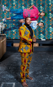
Kehinde Wiley at his Williamsburg, Brooklyn, studio with his painting “Jose Alberto de la Cruz Diaz and Luis Nunez” (2013). Credit Chad Batka for The New York Times

Kehinde Wiley at his Williamsburg, Brooklyn, studio with his painting “Jose Alberto de la Cruz Diaz and Luis Nunez” (2013). Photo by Chad Batka for The New York Times

Wiley’s creations in all their varied media serve to focus his gaze on attractive, confident young men who wield evident power with total comfort. Their poses are usually not so much arrogant as entitled: they address viewers directly without fear or anger. They often display the sartorial signs of success, including name-brand shoes and clothes. Even when they find themselves in dandified poses, Wiley catches them looking unsurprised to be presenting themselves as worthy of their evident power.

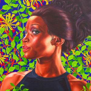
Over time Wiley has added more women to his work, and some of his most recent portraits feature elegant women in formal designer gowns instead of in their street clothes. Their hair is elaborately coiffed and they look like fashion models, but again, there is a sense of self-awareness and power in their expressions. These proud black men and women command attention without effort; they are vivid and dynamic symbols of black strength and power who assert the importance of their place in history and in the modern world.

In an interview with National Public Radio’s Audie Cornish, Wiley said of his decision to incorporate obvious product placement in his works, “Branding says a lot about luxury, and about exclusion, and about the choices that manufacturers make, but I think that what society does with it after it’s produced is something else. And the African-American community has always been expert at taking things and repurposing them toward their own ends. This code-switching that exists between luxury and urban is something that was invented in the streets of America, not Sixth Avenue.”

Most of Wiley’s portraits on canvas are based on photographs that he takes and then adjusts with computer applications to heighten their contrast and make their colors more vivid. But though he takes great care with the paintings of his subjects, he assembles groups of assistants in his studios around in the U.S., China and elsewhere to undertake the background painting in his portraits, much as the great 15th to 17th century painters of the Renaissance and Baroque period had their assistants fill in the areas behind the human subjects.

The backgrounds in his large portraits on canvas are not usually naturalistic landscape or elegant rooms—they are flat, decorative, repeating floral motifs such as one might find on wallpaper by Victorian designer William Morris or by 18th century designer William Kilburn. These floral backdrops hang behind the subjects of Wiley’s paintings, but sometimes elements of them—tendrils or branches or floral sprays—curve around in front of the subjects, surrounding the carefully rendered, three-dimensional human beings with flat fantasy gardens come to life. These delicate, elegant backgrounds contrast with the often dramatically manly subjects of the paintings, heightening the objectification of the body and pointing out the physical beauty in African Americans who have often been made to feel “other,” less than, ugly and unwanted by white Western arbiters of taste, style or value.

In 2006, Wiley found a crumpled police mug shot on the ground near his studio in Harlem. He used this symbol of a young man’s having been stripped of his freedom and power to inspire a beautiful portrait. The anonymous young man is portrayed with great dignity and honesty. Of the painting, NPR’s Audie Cornish said “It’s also the antithesis of the work people may recognize. … If anything, your work, for a lot of people, has been a rebuke of the mug shot when it comes to black men.” Wiley replied that his usual choice to portray black men in positions of power is indeed “a rebuke of the mug shot, it’s an ability to say ‘I will be seen the way I choose to be seen.’ All of the models are going through our history books and deciding, out of all the great portraits of the past, which ones do they feel most comfortable, which ones resonate with them. And so I go through the studios with individuals who go through art history books and choose how they want to perform themselves.”

The mug shot portrait is unusual for Wiley in that, while it shows an evidently self-possessed man displaying dignity and internal strength, it was created without the subject’s knowledge or consent. This back-story makes the viewer consider the question of the subject’s power or powerlessness, and whether Wiley has bestowed an aura of power on the man in the mug shot portrait while denying him the power to determine how and whether to present his face to the world in general. The questions of who has power, where it comes from and whether it is deserved hang over every piece in this exhibition, just as these questions unfortunately hang over the heads of all African Americans who feel that their presence and worth are constantly scrutinized and challenged as they go about their daily lives.

While many of Wiley’s works celebrate temporal authority, this new exhibition also places young black men in the context of spiritual and religious iconography, often posing as if they were martys and saints. One room is filled with elegant gilded triptychs, portraits painted on upright wooden panels with hinged closable doors on either side of the portrait, similar to the way that saints were depicted in shrines in Catholic chapels during the Middle Ages. These paintings don’t have vibrant stylized floral backdrops like the huge portraits on canvas do, but are intimate works of art with either Renaissance-style landscapes or Medieval-style gilding shimmering behind the beautifully, naturalistically painted portraits of black men in modern-day dress and hair styles. The T-shirts and tattoos and dreadlocks make it clear that the men featured in the triptychs are very much modern-day men in timeless settings.

In the stained glass room, tall and vibrant windows as boldly colored and intricately decorated as original 19th century Gothic Revival windows feature men in Converse shoes or Timberland boots, quilted vests and hoodies, African cloth shorts or cuffed jeans standing on plinths like statues, their halos shining above their heads. In these religiously inspired pieces, the subjects still exude great power, but their symbolic association with those who were too good for this world, who were martyred for their purity and courage, shows another aspect of greatness; the power that these men display takes a different, quieter form than his other work.

After the dramatic room-filling portraits on canvas, the intimate triptychs and the solemn, saintly stained glass windows, his oversize bronze busts of black men and women are impressive in that they show further diversity and skill, but they don’t mesmerize the way his other more colorful two-dimensional works do. However, the sculptures do show a charmingly cheeky side to his wit. In one exhibit, three nearly identical black female heads are arranged in a setting reminiscent of ancient Greek and Roman artworks depicting the mythological Three Graces. The three are joined together by enormously long and undulating locks of braided hair. In another, a solemn, dignified man wearing a dashiki, his chin up and head back, looks for all the world like a noble statesman posing for an official portrait from the front, but a bronze hairpick sticks surprisingly out of his natural afro in the back. The importance of black hair as a cultural signifier and symbol of connectedness and continuity within the black experience is underscored by the use of hair as an important decorative and unifying element in a number of Wiley’s paintings and sculptures.

Screen Shot 2016-02-24 at 2.17.15 PM

“Shantavia Beale II,” a painting by Kehinde Wiley, 2012. Photo from the Brooklyn Museum

Art critics are divided on whether to celebrate or deride Wiley for his techniques, his subject matter and his style. Some find the quality of the background painting that he hands off to assistants to be subpar; my experience of his paintings is that they appear to be composed and finished with care, and that they give an impression of greater precision than most large artworks do upon close examination. Other critics deride his reuse of tried-and-true, immediately recognizable poses from masterworks, finding it derivative.

I see Wiley’s reworking of clichéd art-historical tropes into fresh new hip-hop-infused celebrations of modern style as a bracing twist on tired themes. While some writers praise his prolific, vivid output across different media, others complain that he outsources the painting of the backgrounds to other artists (just as was the custom of the great European artists of the Renaissance and Baroque eras) and doesn’t give enough credit to the artists who inspired him. Some detractors find his choice to reuse classical poses unoriginal; they neglect to mention that the history of art has always involved the borrowing, reworking and downright copying of old masters by the new, and that it is this very obvious borrowing from the white Western artworks of the past that helps us to set these works in context and face the racially charged questions they evoke.

In the 16th century Michelangelo copied the sculptures of ancient Greece and Rome; in the 19th century Manet copied the pose of 16th century painter Titian; in the 1960s, Warhol made slavish copies of Campbell’s Soup cans and Brillo boxes and ushered in a whole new art movement. Pop art is today among the most valued and collected genres of art despite being derived from the most banal, repetitive and disposable elements in modern culture. If Warhol is a genius for having his (often unpaid) underlings endlessly reprint silkscreened images of popular entertainment icons based on photos that he didn’t take, color them unevenly in unnatural colors and then turn them over to him to sign, how can Wiley, whose works have layers of meaning and historical signifiers that Warhol’s works often lacked, be dismissed for following in the footsteps of earlier masters?

It is certainly possible for someone to find Wiley’s work lacking for purely aesthetic and technical reasons. However, it does seem that critics are often in a hurry to try to take him down a peg and to speak ill of him more directly and dismissively than they do other less-talented artists who also take inspiration from historical sources, like John Currin, or from artists who elevate pop culture (and even kitsch) to new heights (like Jeff Koons), but who happen to be white. It seems to me that Wiley’s composure and the confident ease with which he expresses himself in interviews might strike some as signs of unearned or unwelcome entitlement. The sense of pride and power with which he imbues his portraits can be found in his demeanor, but I see it not as arrogance or as a threat but as a strong sense of self. I wonder how much the discomfort some feel about his works stems from an unease over the idea of an African American having the power to make artistic choices and elevate those who look like him.

Criticism of Wiley, his work style and his aesthetic reminds me of white criticism of Beyoncé’s latest songs and videos; they’re unapologetically created from a black perspective with a black audience in mind. If we white folk appreciate it and want to buy it too, great, but it’s not specifically for us, and it isn’t the job of black artists to comfort or pander to whites.

Critics seem often to be looking for reasons to denigrate Wiley—his backgrounds are too thinly drawn, they say, or his use of decorative motifs undercuts the seriousness of his work. He cares too much about making things pretty and not enough about making them real, some cry. These complaints feel manufactured to me, and they deny the visceral power, the thrill, the vibrant, vibrating beauty that leaps off his canvases and suffuses the galleries in which his works hang or stand with a glowing, thrumming life force. Trying to reduce works of such emotion and energy to dry theoretical constructs strikes me as ridiculous, like trying to freeze-dry sunshine or to express color using only grey-scale photographs.

Like Warhol and Koons and Rubens before him, Kehinde Wiley is a successful businessman with many people working under him in order to allow him to manufacture expensive luxury goods at a fast clip. But Wiley’s works have a unique power to them, and they are fresh and unusual individual creative works; they are African American cultural signifiers like no others in the art world today. Wiley is clearly obsessed with creation and beauty, and regardless of whether he has assistants to help him, he is personally constantly visualizing and manifesting new visual magic all the time. While the subjects of his portraits look at ease with themselves, Wiley himself is happy to go to uncomfortable places with his art, and to challenge himself by traveling the world, learning about and painting brown-skinned people in Africa, Asia and Europe as well as here in the U.S.

In his NPR interview, Wiley told Audie Cornish, “My love affair with painting is bittersweet. I love the history of art — you asked me about that moment that I first looked at the stuff and when I first fell in love with it. It was only later that I understood that a lot of destruction and domination had to occur in order for all of this grand reality to exist. So what happens next? What happens is the artist grows up and tries to fashion a world that’s imperfect. Tries to say yes to the parts that he loves, and to say yes to the parts that he wants to see in the world, such as black and brown bodies — like my own — in the same vocabulary as that tradition that I had learned so many years before. It’s an uncomfortable fit, but I don’t think that it’s something that I’m shying away from at all. In fact, I think what we’re arriving at is the meat of my project, which is that discomfort is where the work shines best. These inconvenient bedfellows that you’re seeing all over this museum are my life’s work.”

Kehinde Wiley says yes to history, yes to his desires and yes to his vision of the world. His affirmative energy and his willingness to sit with and address uncomfortable questions of gender, orientation and power makes for an electrifying exhibition that invites us to enter into Wiley’s vision and live in A New Republic of his creation.

Edward Hopper—Dark, Detached, Delicious

American painter Edward Hopper was born on this day in 1882. The spare, cool, detached way he depicts his subjects contrasts powerfully with his use of dramatic darkness, intense light and shadow and vivid colors. Hopper’s works are carefully composed to create interest and visual movement even though the subjects themselves are usually completely still.

Hopper painted many architecturally interesting exteriors, landscapes and interior scenes, and even his compositions involving human figures emphasize an architectural sense of balance, order and solidity. The compositions and settings are as much the subject of his paintings as the people portrayed in them are.

Most of Hopper’s masterwork, “Nighthawks,” was painted just after the attack on Pearl Harbor, when the U.S. was plunged into fear that there would be air attacks on the U.S. mainland. Americans began sewing blackout curtains for their windows as the people of Britain had been doing for years in efforts to make it harder for potential attackers to target their homes from the air. But while the country prepared for enemy attacks, Hopper continued to work into the evenings with his studio curtains wide open. Appropriately, “Nighthawks” featured four people awake late at night in an empty landscape, together yet somehow separated from each other in a bright but foreboding cafe.

In nature, nighthawks are nocturnal predators of the nightjar family. They, like the nighthawks of the painting, spend the night awake—restless, watching, waiting.

The contrast between still, calm, composed subjects and vibrant color surrounded by intense darkness makes his works visually exciting, but also inspires feelings of melancholy and alienation. Hopper has inspired many other visual artists, including filmmakers like Sam Mendes, Ridley Scott and the Coen Brothers. Mendes’s bleak and brilliant film “The Road to Perdition” in particular reads as a perfect visual homage to the painter, with each scene composed, colored and lit like a Hopper painting.

Jervis McEntee and the Hudson River School

McEntee

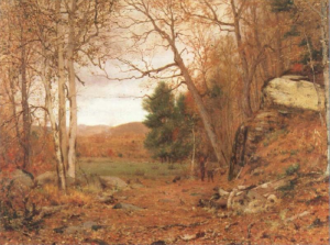
Jervis McEntee’s “Autumn Landscape,” 1867

“I start with no new vows or resolutions but with a fervent hope that I may be diligent, truthful and able to resist temptation in whatever form and to have the courage and the will to live up to my ideal of a true life.” — Painter Jervis McEntee’s diary entry from January 1, 1883


Jervis McEntee was a member of the Hudson River School of American painters, a mid-19th century art movement known for romantic, poetic landscape paintings. McEntee’s works frequently feature autumnal subject matter and an earth-toned palette, which lends his work a melancholic air. “Some people call my landscapes gloomy and disagreeable,” McEntee wrote in his journal. “They say that I paint the sorrowful side of Nature, that I am attracted by the shadows more than by the sunshine. But this is a mistake. I would not reproduce a late November scene if it saddened me or seemed sad to me. In that season of the year Nature is not sad to me, but quiet, pensive, restful. She is not dying, but resting.”


While McEntee never had the success of some of the better-known members of the group, such as Frederic Edwin Church and Albert Bierstadt, he was a close friend and traveling companion to major Hudson River School artists. Though best known for his quiet and solitary paintings, McEntee socialized regularly with other artists. He and his wife Gertrude, a singer, welcomed many painters, writers and performers into their home. Together they encouraged the arts in America much as French salonnières of the 17th and 18th century had done.


Upon McEntee’s death, his mentor Frederic Church wrote to the painter’s sister, saying, “You have lost a brother and I a lifelong friend—a man pure, upright and as modest as he was gifted.” McEntee kept detailed diaries describing his interactions with artists, his travels, exhibitions and prices of paintings sold at them and his chronic economic woes. While I find his paintings evocative and moving, he is today best appreciated for his diaries, which are kept in the Smithsonian Institution’s Archives of American Art. They give rich and fascinating insights into the lives of 19th-century American artists.