[Revised from an article originally published on Laura Grey’s Little Hopping Bird blog.]
When Americans think of art museums and so-called great art, Impressionism usually comes to mind. Impressionist artists and their work are among the most popular in traveling exhibitions and Impressionist paintings are frequently reproduced on coffee cups, calendars, posters, stationery and other gift shop items. The art section of any bookstore is likely to be well stocked with books on Impressionists; in fact, you’ll probably find more of them represented than you will artists of any other style or period. If you have children in public schools, any art education they’re likely to receive probably includes repeated lessons about and images by Monet, Van Gogh and Renoir, with some nods to Picasso, Michelangelo and Leonardo da Vinci (who should always be referred to as “Leonardo” and not as “da Vinci,” by the way, despite what Dan Brown tells you—”da Vinci” isn’t a last name, but means “from the city of Vinci”).
Is this because Impressionists are better or more important artists than those who came before or after them? Probably not. Were they revolutionary? Yes, some of them were, some of the time. They emphasized a fresh way of seeing and of expressing what they saw, although artists had used loose brush strokes and tried to capture evanescent moments, the shimmer of gold, a quick impression of a lace collar or a glinting eye hundreds of years beforehand with fully as much wit and originality, to my mind. The influence of 17th century artists like Vermeer, Frans Hals, Rembrandt and Velazquez on the Impressionists is well-known. In fact, I find those original, inspiring 17th century works more beautiful, more exciting and more inspiring on the whole. The huge popular appeal of the Impressionists is largely because they’re more accessible; the pale colors are pretty, the shapes are indistinct and inoffensive, the subject matter is usually G-rated, universally acceptable and pleasing. Dark portraits of unattractive people, who were the subjects of some of the greatest works of the old masters, don’t have the same popular appeal as fields of poppies or women with umbrellas standing in sunny Provençal lavender fields. They look nice on cards to Grandma or on the dentist’s waiting room walls or on your office calendar. Pastels are pretty. Waterlilies are nice. We all like flowers.
Of course Renoir and Monet and their pastel-fancying contemporaries did see the world with fresh eyes and provided us with a new way of seeing and of expressing what we see. They are great artists, many of their works do challenge and please, and their works are worth knowing. But there’s so much more beauty in the world to challenge the eye and delight the heart, I wish people would look beyond the easy and obvious more often and think outside the Impressionistic box.
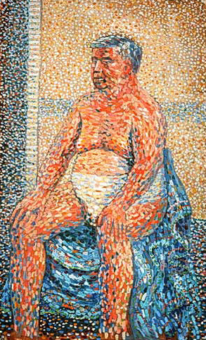
Some Impressionists move me greatly and delight my eye, of course. George Seurat’s pointillist masterpiece, “Un dimanche après-midi à l’Île de la Grande Jatte” (“A Sunday Afternoon on the Island of La Grand Jatte”), inspired Stephen Sondheim‘s Broadway musical Sunday in the Park with George for a reason: it is bold and arresting, beautiful and unusual, and the placement of thousands of dots of paint next to other complimentary or contrasting colors in order to create a freshness, depth and a magical reaction in the eye is delightful and original.
Edouard Manet‘s portraits of demimondaines in paintings like “Le déjeuner sur l’herbe” (“The luncheon on the grass“) or “Olympia” are worldly and confrontational, darker and starker than the sweet mother-and-daughter paintings of Mary Cassatt or the rotund, soft-focus, spun-sugar nudes of Renoir, who sometimes look to me as if they were dipped in frosting and rolled in candy sprinkles. Manet handles the paint roughly and uses flatter patches of light and dark to evoke dramatic lighting and moods, and his characters face viewers unapologetically and draw us into their world with some force.
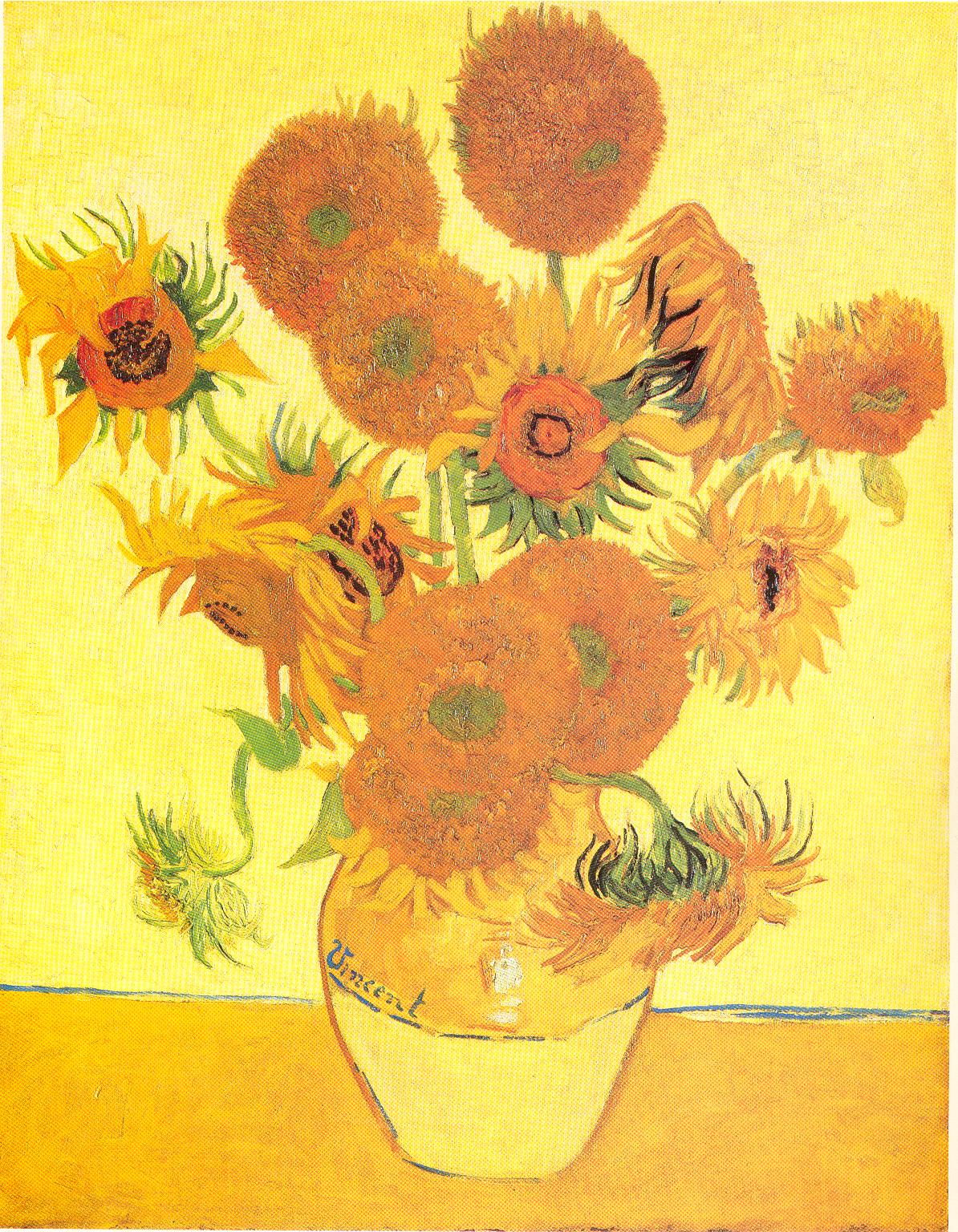
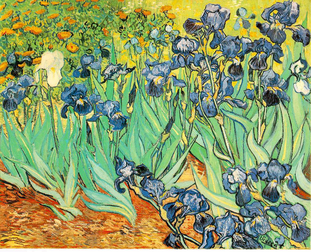
Van Gogh is justly famous for his sunflowers and irises and his starry night, and I do love them, but his more disturbing portraits of working people and of himself really prove him to be a master. His work reproduces badly because his impasto technique of applying paint so thickly to the canvas as to make it almost a bas relief is so vivid and three-dimensional, it simply can’t be adequately represented in a two-dimensional approximation. Also, we’ve become so jaded by the endless reproductions of his work, it’s hard to see them as fresh and original and world-changing the way they were when he painted them.
Among Impressionists one of my favorites is Gustave Caillebotte (roughly pronounced KY-uh-BOT). His compositions are bold but pleasing, and his mastery of perspective and prodigious technical skills are extraordinary. His angles are dramatic and add such movement and excitement to a painting, and the people within aren’t frantic even though they are active, on the go, moving toward or away from us at a steady clip and with a sense of purpose. “Jour de pluie” (“Rainy Day”) has people walking directly towards us and being cut off at the knees, they’ve come so close.
The way they’re cropped makes them seem that much nearer to us, and we see just the elbow of someone retreating, so he’s right on the edge of the picture plane, pulling us with him into the thick of the action. Then there are the smaller figures cutting across the middle and the one carriage wheel moving off to the left, so while our eyes are drawn to the couple approaching us, there’s just enough cross-traffic to keep our eyes moving through the layers of activity toward the back.
Finally, there’s that marvelous flatiron-shaped building on the left jutting toward us, and the perfectly receding wet cobblestones on the left and the modern sidewalk on the right bisected by yet another diagonal. All those diagonals and perfectly executed examples of perspective are at just the right angles to imply movement without cluttering the composition so much that we’d be left exhausted and distracted by too many competing areas of activity. There are enough places for the eye to rest before moving on to keep us from getting tired out by too much clutter, and those resting points give us enough time to satisfy our curiosity before we move on.
It’s pretty nearly perfect compositionally. Consider the languid, calm faces of the couple approaching us; they’re engaged and active but not frantic, and that keeps the attitude of the piece right, too; too much animation in their faces would feel like overkill in such a busy painting.
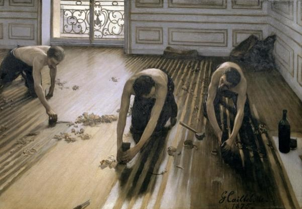
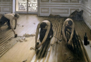
Another favorite painting of mine is Caillebotte’s “Les Raboteurs de Parquet” (“The Floor Scrapers”). The angles of the diagonal lines vary from left to right to accommodate the shift in our perspective because we’re standing in front of and above the planers on the right. Again, the perspective feels perfect and makes us feel we’re right in the room, part of the action, so close we can hear the wood curls being shaved up from the floor.
I love the shininess of the unplaned wood planks versus the dull pallor of the planed areas, and the fact that the planers are shirtless, their skin buttery and similar in tone to the newly planed wood. The only curves in the room are the curves of their heads and arms and arching backs, the curve of the liquor bottle and glass on the right, which promise relief from their tiring work, and the swirling arabesques of the wrought iron on the balcony shown through the glass door. The men, the bottle and the iron work look so much more sensuous and sinuous than they would otherwise because of the severe contrasting lines of the floor and the molding on the back wall.
This picture makes tiring manual labor and tedious craftsmanship look sexy. The fact that the men are shirtless also makes us think it must be a hot day, and that lets us imagine the smell of the wood shavings and sweat. The exciting combination of perfect composition and the implication of controlled but constant motion and intensity of focus of each man elevates a painting of three hot, tired workmen toiling on their knees to strip a floor, the most seemingly mundane of acts, into something extraordinary.
Again, each setting and each character within the setting is perfectly composed. Not only is the relationship between elements harmonious and pleasing, but the faces of all the people in each setting are calm, unaware of the gaze of outsiders (i.e., we, the viewers) who have burst into their presence. We’re just a short distance from them yet they remain distant from us emotionally, which lets us feel safer and less confronted by their proximity, so we can peer at them more directly without feeling challenged by them, like voyeurs. That a painter can create such realism and intimacy with imaginary characters by applying some oily pigments to a stretched piece of fabric is astonishing. To me, that is great art.